LIMITED TIMELifetime Deal: Get all Pro features for just $399 — one-time payment, forever access!Grab the Deal →
What Is Conditional Logic in Forms? A Plain-English Guide
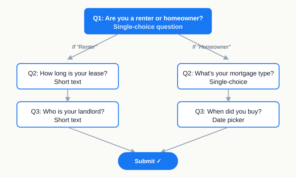
You’ve probably filled out a form that felt like it knew you.
You picked “I’m a renter,” and the next questions were about your landlord — not your mortgage.
You answered “no” to a screening question, and the form quietly skipped the next ten irrelevant ones. That invisible bit of intelligence is conditional logic, and it’s one of the most underused tools in form design.
If a regular form is a textbook — every reader gets the same chapters in the same order — a form with conditional logic is a choose your own adventure novel.
It adapts to what you say.
It only shows you the questions that actually match your situation, and skips the rest.
How conditional logic actually works
At its core, conditional logic is one rule: if answer A, then do B.
That “do B” can mean show a question, hide a question, jump to a different section, or even change which thank-you screen the respondent lands on.
Here’s what the simplest version looks like:
One question, two paths, two completely different follow-ups.
You don’t write code for any of this — modern form builders let you set up rules with dropdowns: “If Question 1 = ‘Renter,’ show Question 2A. Otherwise, show Question 2B.” That’s the entire grammar.
The simplest version is show/hide — a question appears or disappears based on an earlier answer.
More advanced flavors include skip logic (jumping past entire sections), piping (using an earlier answer inside a later question), and calculated fields (running scores or eligibility checks in the background).
Most teams feel a real difference with just the first two.
Three quick examples
The best way to understand conditional logic is to see it doing actual work.
Here are three forms you’ve probably encountered — or built — where logic was carrying the weight.
1. Lead generation: qualifying without scaring people off
Picture a “Request a demo” form with no logic: name, email, company size, role, budget, timeline, use case, current tool.
Twelve fields. Half of them won’t apply to a given visitor, and a lot of people quit before submitting.
With conditional logic, the form opens with one question: Are you evaluating for yourself or a team? If they pick “myself,” it asks two more questions and ends.
If they pick “a team,” it branches into the qualifying questions sales actually cares about — company size, decision timeline, current stack.
Same form, two paths.
Marketing gets richer data on real prospects, and tire-kickers don’t get punished with an interrogation. Cutting irrelevant questions is also one of the most reliable ways to reduce form abandonment.
2. HR onboarding: one form for every kind of new hire
A new-hire intake form has to handle a lot of edge cases.
Full-time employees need tax forms and benefits enrollment.
Contractors need a W-9 (or local equivalent) and an NDA.
Interns need a different set entirely.
Without logic, HR ends up running three separate forms — or worse, one bloated form where everyone wades through fields that don’t apply.
Conditional logic collapses all three into a single intake.
Question one: What’s your employment type?
Based on the answer, the form unlocks the right document uploads, asks the right tax questions, and routes the submission to the right person internally.
New hires see only what’s relevant to them, and HR gets clean, consistent data on the back end.
3. Customer feedback: digging deeper, only when it matters
A standard feedback survey often opens with a satisfaction score. Most people give a 7 or 8 and move on — fine.
But the gold is in the 1s, 2s, and 10s, where you find out what’s broken and what’s working.
With conditional logic, you ask “How satisfied are you?” and then branch:
Score of 1–3: “What went wrong? What should we have done differently?”
Score of 4–7: “What’s one thing we could improve?”
Score of 8–10: “What did you love? Mind if we share this as a quote?”
Three audiences, three different conversations, all inside one form.
Happy customers stay happy (no annoying complaint questions).
Unhappy customers feel heard.
And you collect testimonials and detractor signals in the same flow.
Now that you know what it is
Conditional logic isn’t a feature you toggle on and off — it’s a design choice that changes how your form feels.
Done well, it makes a long form feel short.
Done badly, it makes respondents feel watched.
The difference comes down to whether the next question feels earned by the previous answer.
Most modern form builders — Rowform included — ship a visual logic editor on the free plan, so you can experiment without writing a line of code.
Webflow Form Conditional Logic: What It Can’t Do (and What to Use Instead)
If you’ve spent any time building forms in Webflow, you’ve probably hit the wall: there’s no way to show or hide questions based on what someone picks.
No branching. No skip logic. No “if they answered ‘yes’, jump to question 5.”
You just get a static list of fields that everyone sees, in the same order, every time.
This post is for the people searching “webflow form conditional logic” hoping the feature exists somewhere deep in Form Settings.
It doesn’t.
Here’s what Webflow forms actually do, why the popular workarounds fall apart in production, and what a clean solution looks like.
What Webflow forms support natively
Webflow’s Form Block is deliberately minimal.
You get the basics: text fields, textareas, email inputs, radio buttons, checkboxes, selects, file uploads, and a submit button.
Submissions route to Webflow’s form collection, or you can pipe them to services like Mailchimp, HubSpot, or Zapier via the built-in integrations.
That’s the whole feature set for logic-free forms.
There is no built-in concept of a field depending on another field’s value, no question groups, no multi-step flow, no piping answers into later questions, no calculated fields.
Webflow’s own documentation confirms forms are intended for straightforward contact, newsletter, and lead-capture use cases.
For a homepage contact form or a simple newsletter signup, that’s fine.
The moment your form needs to qualify leads, route users down different paths, or adapt to the answers someone gives, you’re outside what the platform supports — which is the core of what Webflow form builder limitations come down to.
The workarounds people use (and why they break)
A quick search turns up three common workarounds.
Each one has tradeoffs that bite you later.
Custom JavaScript inside an embed. You drop an HTML Embed into the form, write a script that listens for field changes, and toggle display: none on later fields.
This works in a demo.
In production, you’re maintaining JavaScript against a form markup structure Webflow can change without notice.
Every visual edit in the Designer risks breaking your selectors.
And form validation, submission handling, and accessibility (focus order, screen reader announcements) become your problem to solve from scratch.
Finsweet-style attributes. Libraries that let you add fs-attributes to elements to trigger show/hide behavior work for basic branching. T
he ceiling is low: you can show Field B when Field A equals “yes,” but you can’t easily handle nested conditions, score-based routing, or conditional logic across multi-step forms.
You also take on a third-party dependency whose maintenance cadence isn’t yours.
Embedding a different tool via iframe. People embed Typeform, Jotform, or Google Forms inside a Webflow Embed block.
This is honest — it acknowledges that the form tool and the CMS are different jobs.
The downsides are styling mismatch, branding you can’t fully remove on free tiers, and the iframe often looking bolted-on to an otherwise polished Webflow page.
None of these are wrong.
They’re just load-bearing hacks for something the platform was never designed to do.
The form-abandonment cost adds up fast when users hit friction — our form abandonment framework gets into the numbers on how much irrelevant-question fatigue costs you in completions.
What proper conditional logic looks like
Before comparing tools, it helps to name what “proper” means.
Real conditional logic in forms usually includes four things: branching (send different users to different questions based on answers), skip logic (jump past irrelevant sections entirely), piping (use an earlier answer inside a later question), and calculated fields (scores, totals, eligibility checks).
Here’s how Webflow native compares to embedding a dedicated form tool like Rowform:
Capability
Webflow native forms
Rowform embed in Webflow
Show/hide based on answers
Not supported
Built-in, no code
Branching to different paths
Not supported
Built-in
Skip logic
Not supported
Built-in
Multi-step with progress bar
Not supported
Built-in
One-question-per-screen layout
Not supported
Default on mobile
Calculations / scoring
Custom JS only
Built-in
RTL language support
Manual CSS work
Native (Arabic, Hebrew, Urdu)
Integrations (Slack, Zapier)
Via Webflow’s integrations
Via Rowform’s integrations
Styling to match your site
Full (it’s Webflow)
Theme controls + custom CSS
The pattern is consistent: Webflow’s form block is excellent at being a form block.
It’s not trying to be a form builder.
When the job needs branching, you use Webflow for the page and a dedicated tool for the form.
How to embed a Rowform conditional form into Webflow
The embed flow is short.
I’ll use Rowform as the example since it’s what I build, but the same four-step shape applies to any tool you’d embed in Webflow.
Build the form with logic. In Rowform, add your questions and open the Logic panel on any question. Set a rule like “If Question 1 = ‘Enterprise’, jump to Question 5.” Nest as many rules as you need — the builder handles multi-level branching without you writing any conditions by hand.
Grab the embed code. In Rowform’s Share panel, switch to the Embed tab. You can choose inline (renders within the page flow), full-page (takes over the viewport), or popup (triggered by a button). Copy the snippet.
Paste into a Webflow Embed element. In the Webflow Designer, drag an Embed component to the spot on your page where the form should live. Paste the snippet. Save and preview.
Publish. That’s it. The form renders inside your Webflow layout, branches based on user answers, and posts submissions back to Rowform — where you can forward them to Slack, Zapier, a webhook, or your CRM.
A few practical notes on how to embed a form in Webflow cleanly: set the Embed component’s width to 100% so the form is responsive inside your container, and if you’re using the inline mode, give the parent section a minimum height so the page doesn’t jump as the form loads.
The honest takeaway
Webflow is a design tool first.
Its forms are built for simple captures, and stretching them to do conditional logic usually costs more in JavaScript maintenance than the workaround is worth.
If your form’s job is just “collect an email,” stay native.
If it’s qualifying leads, running a quiz, routing a support request, or any flow where the next question depends on the last answer, embed a form tool that was built for it.
Rowform is one option — free tier, no-code logic builder, and clean Webflow embed.
Whichever you pick, the move is the same: use Webflow for the page, and stop trying to make the form block do something it was never meant to.
How to Show and Hide Form Questions Based on Answers
Most forms ask the wrong people the wrong questions.
A lead capture form asks “How many employees?” to a solo founder.
An event registration form asks about dietary restrictions when the attendee is only joining online.
A customer support form asks which plan you’re on — and then asks again, two questions later, in a slightly different way.
The fix is simple in concept: show questions only to the people they apply to, and hide them from everyone else.
That’s what show/hide logic (also called conditional logic, branching logic, or skip logic) does.
Done well, it cuts form length in half without losing any data, and it consistently lifts completion rates by 20–40% in our own testing and in published research on form design.
This guide walks through exactly how to build show/hide logic into an online form, the patterns that work best, and the cases where conditional logic actively hurts.
What show/hide logic actually means
In a standard form, every respondent sees every question.
In a form with show/hide logic, the questions a respondent sees depend on how they answered earlier questions.
A simple example: if someone selects “I’m a solo founder” on question 1, the form skips past questions about team size and company structure and jumps straight to product interest.
If they select “I work at a company,” the form shows those team questions and skips the solo-specific ones.
The underlying mechanic is an if/then rule attached to a field:
If question 1 answer = “Solo founder”
Then skip questions 2, 3, 4 (and show questions 5, 6)
You can chain these rules.
A first answer opens up a branch, a second answer within that branch opens up a sub-branch, and so on.
But chains get brittle fast — more on that at the end.
Step-by-step: building a show/hide form
The exact interface will vary depending on your form builder, but the underlying workflow is the same everywhere. Here’s how it works in Rowform:
1. Map the logic before you build
Before opening any form builder, sketch the flow on paper or in a simple diagram tool. For every question, ask: who should see this, and who shouldn’t? Group your respondents into two or three personas and trace what a clean path looks like for each one.
This step saves hours. Most broken conditional forms break because the builder tried to design and plan simultaneously.
2. Build the form linearly first
Create every question you might ever show — in the order a maximally curious respondent would see them. Don’t add any logic yet. Just get all the fields into the form.
In Rowform, you can do this quickly by describing the form to the AI builder (“a B2B lead qualification form with role, company size, current tools, budget, and timeline”) and editing the generated output. Or build it block by block in the Notion-style editor.
3. Add the branching question
The branching question is the one whose answer changes the rest of the form. It’s almost always a single-choice or multiple-choice field, because show/hide logic needs discrete answers to trigger against.
For a lead form, the branching question is usually role or company size. For a customer feedback form, it’s satisfaction rating. For event registration, it’s attendance type (in-person vs. online).
4. Attach show/hide rules to the dependent questions
Select each question that should only appear for certain respondents. In the field settings, add a rule:
Show this question if [branching question] is [specific answer(s)]
Or, equivalently:
Hide this question if [branching question] is [specific answer(s)]
The “show if” framing is usually cleaner because it’s additive — you’re explicitly listing who should see the question. “Hide if” rules accumulate invisibly and get tangled.
5. Test every branch
This is the step most people skip. Walk through your form as each persona. Does the solo founder see only the four questions they should? Does the enterprise prospect see the full compliance section? Does anyone hit a dead end or a contradictory question?
In Rowform’s preview mode, you can step through the form as a respondent without submitting data, which makes this quick. Regardless of your builder, don’t publish until you’ve manually tested each branch.
Common patterns that work
A handful of conditional logic patterns show up again and again because they solve real problems. If you’re not sure where to start, one of these probably fits your form.
Pattern 1: Qualifying gate
The first question determines whether the respondent is a good fit at all. Unqualified respondents get a short polite closer; qualified ones proceed to the full form.
Use case: Lead capture, B2B sales inquiries, partnership applications. Example trigger: “What’s your budget range?” → if “Less than $X” → show a thank-you screen with a link to self-serve docs. Otherwise → continue to full qualification.
Pattern 2: Segmented path
The respondent selects a category, and the form shows questions specific to that category.
Use case: Support triage, feedback forms, multi-product companies. Example trigger: “What are you contacting us about?” → Billing shows account questions, Technical shows product/error questions, Feedback shows NPS + open text.
Pattern 3: Progressive disclosure
Optional or advanced questions only appear if the respondent opts in or indicates they want to go deeper.
Use case: Onboarding forms, account setup, detailed surveys. Example trigger: “Want to set up advanced integrations now?” → Yes shows Slack, Zapier, and webhook fields. No skips them entirely (and the respondent can come back later).
Use case: NPS surveys, post-purchase feedback, support CSAT. Example trigger: “How would you rate your experience? (1–5)” → 1–2 shows “What went wrong?” (open text, high-priority alert), 3 shows “What would make this better?”, 4–5 shows “What did you love most?” and a request for a review.
Pattern 5: Relevance filter
Questions that only apply to a subset of respondents are hidden from everyone else.
Use case: Event registration, job applications, healthcare intake. Example trigger: “Will you attend in person or online?” → In person shows dietary and accessibility fields; Online shows time zone and platform preferences.
When NOT to use conditional logic
Conditional logic is a tool, not a virtue. There are forms where adding it makes things worse.
Skip it when the form is already short. If you have five questions total and all five apply to everyone, don’t invent branches. The cognitive cost of a “will this question appear next?” guessing game is higher than the cost of answering one extra question.
Skip it when the branches aren’t meaningfully different. If Branch A and Branch B end up asking 80% of the same questions, just ask those questions to everyone and skip the branching.
Skip it when you’re using it to hide long forms. Some teams add conditional logic to make a 40-question form feel shorter. It doesn’t — respondents still spend the same time — and it often makes the form feel inconsistent and confusing across sessions. If your form is too long, cut questions. Don’t hide them.
Be careful with deep chains. Logic that depends on logic that depends on logic becomes impossible to test and maintain. If you find yourself building a tree four levels deep, it’s usually a sign the form is trying to do too much and should be split into two forms or a multi-step workflow.
Show/hide logic is especially valuable on mobile, where every extra question on a small screen is a visible commitment that increases drop-off. A form that looks reasonable on desktop often looks overwhelming on a phone. Conditional logic, combined with a one-question-per-screen layout, is the combination that tends to convert best on mobile — respondents never see what doesn’t apply to them, and each question feels small and answerable.
This is one of the reasons Rowform defaults to one question per screen with conditional logic built in from the start, rather than bolted on later. The mobile experience is the default experience, not an afterthought.
Start simple, then layer
The biggest mistake people make with conditional logic is building the full decision tree on day one. Start with a single branch: one qualifying question that splits respondents into two paths. Ship it. Watch how respondents actually move through the form. Then add a second branch based on what you learn.
Forms that evolve in response to real data outperform forms that were designed to handle every edge case from the start. Conditional logic rewards iteration more than it rewards planning.
Conditional Logic in Forms Explained: Show the Right Questions to the Right People
We have all been there: staring down a massive, scrolling web form packed with questions that have absolutely nothing to do with us—the unmistakable sign of a form built without conditional logic.
Whether it is a job application asking for an extensive work history when you are applying for an entry-level role, or a software survey asking about features you’ve never used, conditional logic is exactly what would have spared you from these irrelevant questions.
Filling out a form shouldn’t feel like a chore.
When forms are long and static, users either abandon them entirely or fall victim to “satisficing”—the act of selecting random answers just to finish the process faster.
This hurts both the user experience and your data quality.
The fix is straightforward: by turning a rigid interrogation into an intelligent, adaptive conversation, conditional logic ensures you are always showing the right questions to the exact right people.
What is Conditional Logic?
At its core, conditional logic relies on a simple computational “if-then” formula.
It is a structural methodology that allows a digital form to adapt in real-time based on the answers a user provides.
Instead of forcing every user down a single, linear path, conditional forms branch out in different directions, taking respondents to different destinations depending on the choices they make.
For example, if a user selects “Yes” to owning a business, the form instantly reveals follow-up questions about their industry.
If they select “No,” those questions stay completely hidden.
This idea of presenting one thing at a time is also the philosophy behind one-question-per-screen form layouts, used by tools like Rowform, where each question gets its own screen—making branching feel less like a detour and more like a natural conversation.
The Key Mechanisms of Smart Forms
Conditional logic comes in a few different flavors, each serving a specific purpose to streamline the user journey:
Show/Hide Logic: This dynamically reveals or conceals specific fields or sections on the exact same page based on user inputs. It is perfect for keeping your user interface clean and preventing information overload.
Skip & Branching Logic: This directs respondents down distinct, personalized question sequences or skips them past irrelevant pages entirely. Unlike show/hide logic which controls individual fields, skip logic determines which overarching sections a user will see.
Disqualification Logic: Not every user is a good fit for your services. Disqualification logic automatically ends the session or redirects users who do not meet predefined criteria. This ensures your sales team doesn’t waste time on dead-end leads, preventing low-quality data from polluting your CRM.
Calculation-Based Logic: Forms can process mathematical operations in the background based on user inputs. This is highly effective for dynamically generating price quotes, quiz scores, or loan estimates without making the user do any manual math.
Why forms with conditional logic are Game-Changers
Implementing conditional logic does far more than just make your forms look sleek. It fundamentally transforms your data collection and lead generation strategies.
1. It Lowers Perceived Effort (Progressive Disclosure) According to the EAS framework (Eliminate, Automate, Simplify), forms should ask for the bare minimum of effort from the user to improve completion rates.
Conditional logic utilizes “progressive disclosure,” revealing information only as it becomes necessary.
By starting with broad inquiries and keeping follow-up questions hidden until triggered, the form appears significantly shorter and less intimidating.
This reduces friction, slashes form abandonment rates, and boosts conversions.
This is exactly the principle behind mobile-first form builders that present one question at a time.
Rowform, for instance, pairs its one-question-per-screen layout with built-in progress indicators—so respondents always know how far along they are without being overwhelmed by the full scope of the form upfront.
2. It Protects Your Data Quality When users are forced to answer questions that don’t apply to them, they guess.
This contaminates your dataset with “noise” and skews your averages.
Because skip logic ensures respondents only interact with highly relevant questions, it actively eliminates random guessing and satisficing, guaranteeing the data you collect is accurate and actionable.
3. It Supercharges Lead Qualification Unqualified leads are a massive hidden cost; in fact, roughly 73% of marketing-generated leads are unqualified for sales engagement.
Forms equipped with conditional logic act as automated gatekeepers. By evaluating a lead’s budget, timeline, and authority using qualification frameworks like BANT (Budget, Authority, Need, Timeline) or CHAMP, the form can fast-track high-intent buyers straight to a meeting scheduler.
Simultaneously, it can gently route low-intent browsers to educational resources or a polite disqualification page.
Real-World Examples in Action
SaaS Onboarding: An onboarding form asks if the user is an “Admin” or an “End User”. Admins are routed to questions about team management and access, while end users are asked about usability and daily workflow friction.
E-Commerce Orders: A custom jewelry order form only shows engraving text fields if the user specifically requests personalization, or asks for shipping details only if physical delivery is selected.
Customer Feedback: Post-purchase surveys can ask for a satisfaction rating from 0 to 10. Promoters (rating 9-10) are directed to a page asking for a testimonial, while detractors (rating 0-6) are asked what went wrong and immediately escalated to customer support.
Event Registration: A conference registration form skips dietary restriction and hotel accommodation fields entirely for attendees who select a “Virtual Only” or general admission ticket.
Best Practices for Building Conditional Logic Forms
If you are ready to implement conditional logic, keep these foundational rules in mind to avoid creating a confusing maze for your users:
Map it out first: Before touching your form builder, map your branching routes on paper or using a visual logic map. This will help you catch logical “dead ends,” infinite loops, and conflicting paths before you build anything.
Keep it simple and use positive logic: Avoid overcomplicating your logic flows with too many nested branches. When writing the rules, prioritize positive “If” statements (e.g., “If X equals 5”) over negative ones, as double negatives make your logic incredibly difficult to read and troubleshoot.
Keep it linear: Turn off back-navigation or “previous” buttons when using advanced conditional logic. Allowing users to jump backward and change early answers can break your branch consistency and corrupt your data. Progress bars should also often be hidden to avoid confusing users when they unexpectedly skip from question 3 to question 7.
Test relentlessly: Never publish a branched form without testing it. Walk through every single answer combination—a process known as “branch coverage”—to ensure the right fields show up for the right scenarios and that no required fields are accidentally hidden.
Let AI handle the heavy lifting: If mapping out complex branching feels daunting, consider AI-powered form builders that can generate conditional forms from a simple text prompt.
Tools like Rowform let you describe your form in plain language and get a working draft with logic paths already in place—so you can focus on refining rather than building from scratch.
By trading static, one-size-fits-all forms for dynamic, responsive logic, you build a foundation of trust with your users.
You respect their time by only asking what is relevant, and in return, they reward you with higher completion rates and pristine data.
5 Signs You’ve Outgrown Google Forms
Google Forms is a fantastic, free tool for simple surveys, internal feedback, and basic event RSVPs.
But as your organization scales, the “spartan but functional” nature of Google Forms can create technical and operational bottlenecks.
If you are relying on clunky workarounds or spending hours managing spreadsheets, it might be time for an upgrade.
Here are five clear signs you’ve outgrown Google Forms.
Sign 1: Your Workflows Require Multi-Stage Automation and Approvals
Google Forms operates on a “fire and forget” model, meaning once a submission is received, the system’s job is simply to store it in a spreadsheet.
If your business needs non-linear flows—like expense reporting, time-off requests, or contract approvals—Google Forms lacks native mechanisms to route data to different approvers or inform the next person in the chain of their responsibility.
You also cannot send automated, scheduled reminders to participants without manual effort or third-party add-ons, which often leads to poor engagement and “no-shows” for events.
If you are spending more time tracking who has a form than doing the actual work, your infrastructure has become a liability.
Modern form builders address this by offering native integrations with tools like Slack, Zapier, and webhooks, so submissions can trigger downstream workflows automatically—no spreadsheet babysitting required.
Rowform, for instance, ships with built-in Slack, Zapier, and webhook integrations out of the box, letting you route responses to the right people and systems without duct-taping add-ons together.
Sign 2: You Need to Process Payments or Collect E-Signatures
Google Forms does not offer native payment collection or electronic signature fields.
Redirecting users to external payment gateways creates significant friction that leads to higher abandonment rates and lost revenue.
Furthermore, relying on file uploads for signatures provides a poor user experience and raises questions about the auditability and legal validity of the agreement.
If your forms involve financial transactions or legally binding documents, you need a tool with integrated payment processors and native e-signature capture to ensure a seamless, secure workflow.
Sign 3: You Require Advanced Conditional Logic and Personalization
While Google Forms offers basic branching that sends users to different sections based on a single answer, it falls drastically short for complex needs.
You cannot set up multi-condition rules, such as showing a specific question only if multiple previous conditions are met.
Additionally, Google Forms lacks “answer piping,” a feature that inserts a respondent’s previous answers into subsequent questions to personalize the experience.
If you want to create intelligent, adaptive interfaces that feel conversational rather than robotic, you have outgrown Google Forms.
Tools built around a one-question-per-screen layout like Rowform’s mobile-first flow with built-in progress indicators, naturally guide respondents through a focused, conversational experience that keeps completion rates high.
Sign 4: You Are Struggling with Slot Limits and Scalability
Managing event capacity or limited inventory is a nightmare in Google Forms because it cannot natively cap specific time slots or options.
Unless an administrator manually closes the entire form, it will continue accepting responses, leading to awkward overbooking and waitlist issues.
At scale, Google Forms also hits technical ceilings, as the underlying Google Sheets degrade in performance near their 5-million-cell limit, and high-volume operations can encounter API quota errors.
When your volume demands automatic inventory limits and robust database performance, a spreadsheet-backed form is no longer sufficient.
Sign 5: Your Brand Identity and Analytics Are Suffering
In an era where user experience drives brand trust, the generic look of a Google Form can appear unprofessional and disconnected from your company’s identity.
Customization is limited to basic colors, fonts, and a header image, making it difficult to maintain cohesive branding. Moreover, Google Forms provides only basic summary charts and is completely blind to user behavior before submission.
If you need to analyze field-level drop-off rates to optimize conversions, or require custom CSS to match your website perfectly, it is time to upgrade to a professional form builder.
A Notion-style block editor, like the one in Rowform, gives you granular control over layout and structure without needing a designer, while AI-powered form generation lets you go from a text prompt to a polished, branded form in seconds rather than hours.
The Bottom Line
Spreadsheets and Google Forms are great when you are just starting out.
But when manual upkeep drains your energy and administrative wrangling prevents growth, it is a clear signal to transition to a more powerful, automated intake architecture.
If you are exploring alternatives, Rowform offers a free tier to get started.
Worth a look before committing to a larger platform.
The Psychology of Anonymous Forms: Why People Tell the Truth Behind a Digital Mask
In the pursuit of truth within any organization, business, or clinical setting, two powerful psychological forces consistently stand in the way: the desire to look good in front of others and the fear of retaliation.
Whether you are surveying employees about workplace culture, asking patients about their medical history, or soliciting customer reviews, getting an honest answer is notoriously difficult.
This is where anonymous forms and surveys come into play.
By removing a person’s identity from their responses, you can bypass psychological barriers and tap into unfiltered reality.
But anonymity is a double-edged sword that requires a strategic approach to use effectively.
The Psychology Behind the “Mask”
To understand why anonymous forms yield more honest responses, we must look at the online disinhibition effect, a concept popularized by psychologist John Suler.
When people operate behind a digital mask, their internal filters are recalibrated through several psychological mechanisms:
Dissociative Anonymity: Respondents separate their digital actions from their physical, offline identities, massively reducing their fear of reputational damage.
Invisibility and Asynchronicity: Because respondents cannot see the immediate non-verbal reactions of the person receiving the feedback (like a frown or a look of shock), and because they can delay their responses, they do not trigger the typical “flight” or self-censorship responses required in face-to-face conversations.
Minimizing Authority: Anonymity flattens perceived power hierarchies, making an entry-level employee feel equally as empowered to speak up as a CEO.
Together, these factors drastically reduce social desirability bias—the human tendency to answer questions in a way that will be viewed favorably by others rather than answering truthfully.
Studies comparing paper surveys, identified web surveys, and anonymous web surveys consistently show that anonymous digital forms yield the lowest levels of social desirability bias and social anxiety, alongside the highest participation rates.
Anonymous vs. Confidential: A Crucial Distinction
Before deploying a survey, it is critical to understand that anonymous and confidential are not the same thing.
Strictly Anonymous: It is technologically impossible to trace the data back to the individual. No personally identifiable information (PII) is collected—this means no names, no login IDs, no email tracking, and no IP addresses.
Confidential: The researcher or system does collect identifying information and can link responses to a specific person, but promises to keep that identity a secret from unauthorized individuals (like the respondent’s boss or the public).
The Clear Benefits of Going Anonymous
1. Uncovering High-Stakes Truths and Whistleblowing
Nowhere is anonymity more critical than in corporate whistleblowing.
Data shows that employees who attach their names to reports of fraud or misconduct face a staggering 66% to 82% chance of experiencing retaliation, ranging from being fired to industry blacklisting.
Anonymous reporting channels act as a vital “safe harbor” that breaks the fear barrier, allowing organizations to catch issues that cost companies billions annually.
2. Breaking the Stigma in Healthcare
In clinical settings, anonymous tools radically outperform face-to-face inquiries for sensitive subjects.
For example, in screenings for Intimate Partner Violence (IPV), victims often fear judgment from healthcare providers or retaliation from their abusers.
Research shows that computerized, self-reported anonymous screening captures much higher rates of abuse—particularly psychological abuse—than in-person questioning.
3. Generating New Ideas and Higher Participation
When the perceived “risk” of participating drops, response rates rise.
Anonymity empowers marginalized voices, introverts, and “silent” employees to contribute ideas, critiques, and innovations without the anxiety of workplace politics or stepping on a manager’s toes.
The Dark Side: When Anonymity Backfires
Despite its benefits, anonymity can create a “vacuum of accountability” with significant downsides.
The Empathy Gap and Toxic Disinhibition
When the empathetic “social brake” is removed, some respondents engage in toxic disinhibition.
This manifests as cyberbullying, unproductive venting, and personal attacks.
Sometimes referred to as the “Tyranny of Anonymity,” this phenomenon can destroy psychological safety, particularly in settings like student evaluations of teachers, where a minority of students may use the platform to hurl abusive or discriminatory insults at instructors.
The Credibility Paradox and the “Follow-Up Gap”
In whistleblowing and compliance, anonymity creates a frustrating paradox: it is necessary to get the report, but it makes the report incredibly difficult to investigate.
Analysis of over 2.15 million whistleblowing reports reveals that anonymous reports are substantiated only 33% of the time, compared to 50% for identified reports.
Why? Because investigators face a “follow-up gap.”
In 73% of anonymous cases, investigators cannot ask clarifying questions, gather more evidence, or assess witness credibility, leading to premature case closures.
Eroding Organizational Trust
Relying too heavily on anonymous feedback can inadvertently send a toxic message: it is not safe to speak your mind here.
It can also be used as a crutch by poor leadership to avoid having difficult, face-to-face developmental conversations.
The same principle applies to deceptive UX patterns in forms — what looks like a shortcut to better data often corrodes trust instead.
When to Use Anonymous Forms (and When Not To)
Because of these trade-offs, you must deploy anonymous forms strategically.
When YOU SHOULD Use Anonymous Forms:
Whistleblowing and Ethics Lines: To capture reports of harassment, fraud, or safety violations where the risk of retaliation is high.
Low-Trust Environments: If you are conducting a cultural audit in an organization that lacks psychological safety, anonymity is the only way to establish a baseline of truth.
Sensitive Public Health Research: When gathering data on illegal drug use, sexual behavior, or stigmatized medical conditions.
When YOU SHOULD NOT Use Anonymous Forms:
Stay Interviews and Onboarding: If the goal is to help a specific employee integrate into a team or prevent them from quitting, you must know who they are to intervene. Use confidential surveys instead.
Longitudinal Tracking: If you need to track how an individual’s or a specific department’s sentiment changes over time, or tie feedback to performance metrics like turnover or sales, use confidential data linked securely to your HRIS system.
Best Practices for Designing Anonymous Forms
If you decide an anonymous form is the right tool, you must guarantee technological anonymity.
Strip IP Addresses and Metadata: Ensure your survey platform is configured to disable IP tracking, location tracking, and email-link tracking.
Tools like Rowform are built with this principle in mind—form responses are collected without logging respondent IP addresses or attaching tracking metadata, so anonymity is a product default rather than a setting you have to remember to toggle on.
Implement Data Suppression Thresholds: If you ask demographic questions (e.g., Department and Gender), you risk identifying people through cross-tabulation. (e.g., If there is only one female in the IT department, her “anonymous” responses are immediately exposed).
Set a minimum n-size threshold (e.g., minimum of 5 people) before segmented data can be viewed in reports.
Utilize Two-Way Anonymous Dialogue: To solve the “follow-up gap” in whistleblowing or customer complaints, use advanced platforms that provide the respondent with a secure, encrypted case number.
This allows investigators to message the anonymous reporter back-and-forth to gather evidence without ever discovering their identity.
For teams that need a quick, no-code way to spin up an anonymous survey, a mobile-first form builder like Rowform makes it easy to go from a one-line description to a live, anonymous form in seconds using its AI form builder—useful when you need to deploy a pulse survey or incident report form fast, without a lengthy setup process.
Ultimately, the mask of anonymity does not hide the truth; in many cases, it provides the only environment in which the truth can survive.
By understanding its psychological power and technical limitations, you can use anonymous forms to gather the unvarnished insights necessary to drive real improvement.
The Evolution of Forms: From Data Entry to High-Velocity Revenue Engines in 2026
The contemporary business environment has undergone a fundamental shift in how digital value is perceived.
Historically, digital forms were relegated to the periphery of business operations—viewed primarily as static utilities for simple data entry or administrative compliance.
However, as the digital landscape matures, smart businesses are realizing that customer experience is the true differentiator.
Today, the use of artificial intelligence in form building has surged by 30% over the last year alone, signaling a massive transformation in how companies capture data.
The digital form is no longer just a questionnaire; it is the intelligent, automated front door to your business.
The Paradigm Shift: “Forms as a Product” (FaaP)
To understand this evolution, we must embrace the concept of “Forms as a Product” (FaaP).
This mindset moves beyond simply transitioning from paper to digital archiving; it treats the data collection interface as a primary touchpoint in the buyer journey.
A productized form replaces ad-hoc data collection with structured components, reusable workflows, and measurable performance metrics.
While a traditional form might prioritize information retrieval and storage, a FaaP is engineered as a conversion engine designed for revenue generation and lead velocity.
This shift perfectly aligns with the Revenue Growth Model™ (RGM), which dictates that companies must harmonize marketing, sales, and service resources along revenue segment-specific buyer journeys.
Rather than relying entirely on human sales representatives, interactive digital motions—such as click-to-buy flows, freemium signups, and automated customer service portals—can seamlessly qualify leads and close deals at scale.
Designing for Conversion: UX and Behavioral Psychology
The design of a digital form is not merely an aesthetic choice; it is a critical factor in determining its effectiveness as a revenue channel.
Tools like Rowform take this a step further with a one-question-per-screen layout that guides respondents through a focused, distraction-free flow—paired with built-in progress indicators so users always know how far along they are.
Conversational Interfaces: Ditch the interrogation style.
Shifting copy from “Enter your full legal name” to “What should we call you?” reduces cognitive burden and builds trust.
This is where AI-native form builders are making a real impact.
Rowform, for instance, lets you describe the form you need in plain language and generates it instantly—so the conversational experience starts at the creation stage, not just the respondent’s end.
Mobile-First Optimization: With mobile devices generating the majority of web traffic, touch-optimized design is mandatory.
Buttons should have a minimum dimension of 44×44 pixels to prevent mis-taps, and forms should utilize native OS features and smart auto-fill functions to eliminate tedious typing.
This is a space where many legacy form builders still lag.
Rowform was built mobile-first from the ground up—its one-question-per-screen interface is inherently touch-optimized, and it includes native RTL typing support for Arabic, Hebrew, and Urdu, making it one of the few form tools that genuinely serves a global audience out of the box.
Automating Revenue: Real-Time Lead Scoring and AI
Capturing the data is only the first step.
For a form to act as a high-velocity revenue channel, it must be integrated into a high-performance technology stack.
This is achieved through real-time lead scoring engines that evaluate prospects the moment they hit “submit.”
A sophisticated lead scoring architecture follows a three-step flow: Collect, Score, and Route.
Collect: The system ingests demographic, firmographic, and behavioral data.
Score: The system applies dynamic logic. High-intent actions (like requesting a demo) might instantly add 25 points, while low-intent actions (like opening an email) add 2 points.
Crucially, the system must utilize active negative scoring—deducting points for non-commercial actions (e.g., visiting a “Careers” page or using a generic @gmail.com address) to filter out noise.
It should also incorporate time decay, gradually reducing points for inactive leads to ensure the sales pipeline reflects current buyer intent.
Route: High-scoring leads are pushed directly into the CRM (like Salesforce or HubSpot), triggering immediate sales notifications.
By integrating middleware platforms like Make, n8n, or Pipedream, companies can achieve response velocities of under 10 seconds, boosting pipeline conversion by up to 30%. Increasingly, though, the scoring and routing logic is moving closer to the form itself.
Rowform, for example, includes built-in lead scoring and routing capabilities—so you can assign point values to responses, qualify leads at the moment of submission, and automatically route high-intent prospects to the right team or workflow without needing a separate middleware layer.
Combined with its native Slack, Zapier, and webhook integrations, this means the entire Collect → Score → Route loop can live inside a single tool rather than being stitched together across three or four platforms.
Furthermore, the introduction of Agentic AI allows systems to autonomously detect user sentiment, extract key insights, and adapt the form’s logic in real-time to personalize the customer’s journey.
Choosing Your Arsenal: The Software Landscape
The form builder category has fragmented into highly specialized tools. Choosing the right one depends entirely on your business goals:
Typeform: Best known for its sleek, conversational, one-question-at-a-time interface, Typeform is a powerhouse for top-of-funnel lead generation and market research. However, its restrictive pricing (e.g., $29/month for just 100 responses) and complete lack of offline capability make it a poor fit for businesses on a strict budget or field teams operating without Wi-Fi.
Rowform: If Typeform’s UX philosophy appeals to you but the pricing doesn’t, Rowform is worth a look. It offers a similar one-question-per-screen experience but pairs it with an AI form builder that generates forms from a text prompt, a Notion-style block editor for manual customization, and native integrations with Slack, Zapier, Webhooks, and Calendly. It’s built mobile-first with RTL language support baked in—not bolted on. With a free tier and a lifetime deal option, it’s particularly well-suited for startups, solopreneurs, and growing teams that want a modern form experience without per-response pricing traps.
Jotform: If you need deep operational functionality, Jotform offers over 10,000 templates, advanced conditional logic, robust e-commerce payment integrations, and HIPAA compliance. It is the go-to choice for complex data collection, HR workflows, and inventory management.
Alpha TransForm: For field operations in manufacturing, healthcare, or construction, Alpha TransForm is unparalleled. It features patented offline-first technology, allowing teams to capture GPS data, barcode scans, and digital signatures in remote locations without internet connectivity.
Knack & Form.io: When consumer form builders break down under the weight of complex business logic, developers turn to robust infrastructure. Knack acts as an all-in-one no-code database and form builder, perfect for building full custom CRM and client portal applications. Form.io takes a pro-code/low-code approach, embedding natively within a developer’s application and utilizing a MongoDB document model to handle complex, nested JSON data structures securely.
Monetization and the Trust Economy
Ultimately, forms are a point of transaction.
By embedding native payment gateways (like Stripe or PayPal) directly into the form flow, businesses can seamlessly transition leads into paying customers.
Modern software monetization relies heavily on hybrid models, mixing flat-rate subscriptions, freemium tiers, and usage-based or credit-based pricing to capture users at every stage of growth.
Localizing payment methods—such as offering Apple Pay globally or iDEAL in the Netherlands—can increase conversions by up to 91%.
However, this data extraction must be governed by an ethical data culture.
Compliance with regulations like GDPR and CCPA requires explicit consent, data minimization, and total transparency about how consumer data is used.
In the modern digital economy, prioritizing data protection isn’t just about avoiding fines; it is a competitive advantage that builds lasting customer trust.
Conclusion
The era of the static contact form is over.
By embracing the “Forms as a Product” methodology, applying behavioral UX design, and integrating real-time AI lead scoring, businesses can transform simple data capture into scalable, high-velocity revenue engines.
Why Five-Star Ratings Are Broken (And What to Use Instead)
Most of us interact with five-star rating systems daily.
We rate our Uber drivers, the pizza we just ordered, and the movies we stream on a seemingly simple 1-to-5 scale.
It has persisted as the default instrument for evaluative feedback in digital interfaces because of its perceived simplicity and universal recognition across linguistic boundaries.
But the reliance on star ratings is often a lazy design choice that prioritizes ease of implementation over data integrity.
In reality, five-star scales frequently offer compromised data, frustrate users, and obscure actionable insights. It is time to rethink this outdated mechanism and explore what we should be using instead.
The Illusion of Precision: Inflation and Compression
The primary failure of the star rating system is rooted in a massive misalignment between user intent and the scale itself.
Think about your last Uber ride.
If a driver has a 4.7 rating, they might be considered subpar and run the risk of account deactivation.
This dynamic creates a system where service workers are incentivized to maintain high ratings at all costs, leading to an artificial inflation of scores.
When anything less than a perfect five-star rating is perceived as a failure, the scale collapses into a binary system where only one-star and five-star ratings carry significant weight.
Users have been conditioned to believe that a five-star rating simply means a “passing grade” rather than a mark of true excellence.
As the informational space is compressed into a narrow band—typically between 4.7 and 5.0—the rating system loses its ability to distinguish between “good,” “great,” and “exceptional” performance.
Cognitive Biases and Visual Tricks
The five-star scale is also plagued by deep psychological and cognitive friction.
One respondent might view three stars as “satisfactory” or “appropriate,” while another sees it as a harsh signal of “weak” performance.
Furthermore, the way human brains visually process stars actually distorts reality.
Recent research from Cornell University shows that consumers consistently overestimate fractional star ratings due to the “visual completion effect.”
When we see three-and-a-half stars, our visual system instinctively tries to complete the half-star to restore visual order, making a 3.5 feel closer to a 4.0.
Even worse, five-star scales are breeding grounds for extreme response bias.
On most platforms, ratings form a J-shaped curve because users only bother to leave feedback when their experience is exceptionally positive or catastrophically negative.
The Cost of Systemic Bias
Beyond simply providing inaccurate data, five-star scales can act as a catalyst for systemic inequality.
A landmark Yale School of Management study found that when an online gig-economy platform used a five-star scale, non-White workers received an average of 4.72 stars compared to 4.79 stars for White workers.
Because wages were tied to ratings, this seemingly small gap meant non-White workers earned only 91 cents for every dollar White workers earned.
The multi-point scale provided a “space” for inconspicuous downgrading, allowing evaluators to express subtle, subconscious biases by giving a four-star rating instead of five without feeling overtly prejudiced.
When the platform switched to a binary thumbs-up/down scale, this racial bias was entirely eliminated, effectively equalizing wages.
What to Use Instead
If the five-star scale is fundamentally flawed, what should product designers and UX researchers use to capture authentic user sentiment?
1. Binary Systems (Thumbs Up/Down)
Platforms like Netflix and YouTube famously ditched stars for a binary thumbs-up/down system. Star ratings measure what people think they should like (rating a heavy documentary five stars), but binary systems better capture actual behavioral data (watching silly comedies they would have rated three stars).
Binary choices reduce cognitive load and force evaluators to focus on objective performance—was the problem fixed or not?
For algorithms, a thumbs-down is an unambiguous instruction to personalize content, leading to much higher user engagement.
2. Customer Effort Score (CES)
If you want to predict whether a customer will return, stop asking them how satisfied they are.
Research shows that “effort” is the single strongest driver of customer loyalty.
The Customer Effort Score asks a purely functional question: “How easy was it to resolve your issue today?” A staggering 96% of customers who report high-effort experiences become more disloyal, making CES an “X-ray for operations” that identifies the hidden friction points that generic satisfaction stars completely miss.
The trick is in how you deliver the question.
A CES survey buried at the bottom of a cluttered feedback page will get ignored.
Tools like Rowform are built around the principle that one focused question per screen drives significantly higher completion rates—which is exactly the kind of distraction-free experience a CES prompt demands.
Present the question at the right moment, in the simplest possible format, and you will actually get data worth acting on.
3. Attribute-Based Deconstruction
For complex services, a single overall rating lacks actionable nuance.
Platforms like Airbnb and DoorDash have pioneered attribute-based ratings.
Instead of just rating a stay out of five stars, guests rate “Cleanliness,” “Communication,” and “Location” independently.
This “High-Definition” view of performance pinpoints exactly where a service is failing, providing precise data for operational improvement rather than an opaque communal average.
Designing an attribute-based feedback form requires careful thought about question sequencing and respondent fatigue.
Breaking each attribute into its own step—rather than dumping a wall of rating sliders onto a single page—keeps respondents engaged and reduces the kind of straight-lining behavior that undermines data quality in the first place.
Modern form builders like Rowform default to this one-question-at-a-time layout, which makes it easier to implement attribute-based surveys without building custom UIs from scratch.
4. Semantic Differential Scales
When evaluating brand perception or user interface design, standard 1-to-5 scales often introduce bias through leading statements (e.g., “I find this layout modern”).
The Semantic Differential Scale solves this by utilizing bipolar adjective pairs, such as “Intuitive” versus “Confusing”, or “Modern” versus “Outdated.”
Respondents select a position on a continuum between the two opposites, capturing both the intensity and direction of their perception without being skewed by a leading statement.
5. Open-Ended Feedback Powered by AI
The fundamental flaw of any quantitative scale is that it cannot tell you why a user feels a certain way.
Historically, open-ended responses were avoided because they were too time-consuming to analyze at scale.
But today, advanced AI and Large Language Models (LLMs) can instantly synthesize themes, extract sentiment, and identify root causes directly from unstructured text.
AI can now capture nuance, emotion, and context without ever forcing a customer into a 0-to-10 box, even generating highly accurate “synthetic” satisfaction scores based on language alone.
This shift also changes what a feedback form needs to look like.
Instead of rows of radio buttons and dropdowns, the ideal form might be a single open-text field preceded by a binary thumbs-up/down—simple enough that users actually complete it, rich enough for AI to extract meaning from.
The form itself becomes a lightweight prompt rather than an interrogation.
This is one reason anonymous open-ended formats often yield insights stars never could — people say things in text that they’d never commit to a number.
Conclusion
The five-star rating system is a compromised, lazy instrument that frequently fails to provide the precision required for modern decision-making.
It is time for businesses to retire the stars.
By shifting to binary choices, tracking user effort, implementing attribute-based granularity, and leveraging AI for rich qualitative context, organizations can finally gather feedback that is truly meaningful, equitable, and actionable.
The future of user experience lies not in accumulating more orange stars, but in understanding the authentic human narratives behind the data.
And the forms we use to collect that data should reflect the same philosophy—focused, frictionless, and designed to respect the respondent’s time.
If you are rethinking your feedback mechanisms, tools like Rowform can help you build forms that match the smarter rating strategies outlined above.
Why Teams Are Ditching Enterprise Form Builders for Indie Alternatives in 2026
The SaaS market in 2026 has reached a definitive inflection point where the historical dominance of enterprise-grade form builders is being systematically dismantled by a new class of indie-built tools.
This transition is not merely a function of pricing competition but represents a fundamental shift in the architectural philosophy of data collection, user experience design, and the economic relationship between software vendors and their customers.
The Structural Failure of Enterprise Legacy Software
For decades, the enterprise software paradigm was defined by a misalignment of incentives. Procurement departments, rather than end-users, dictated the feature sets of massive, rigid platforms, which prioritized compliance and administrative control over functional efficiency.
Large SaaS providers are rewarded for building features that appeal to the widest possible market, often resulting in bloated suites where the majority of functionality goes unused.
The productivity hit caused by these legacy systems is quantifiable.
In systems like IBM Maximo, retrieving and saving a small set of records can take up to an hour due to inefficient menu structures, requiring as many as fifteen steps to complete a task that indie tools can perform in one or two.
The “enshittification” of these legacy systems—a process where products become progressively more difficult to use as they prioritize monetization and lock-in—has created a massive vacuum.
Furthermore, corporate bureaucracy in large tech companies often leads to “good enough” releases that are marked off checklists without refinement, causing passionate developers to leave and start their own agile ventures.
Products like Rowform are a direct byproduct of this exodus—built by solo founders who experienced the frustration of enterprise bloat firsthand and chose to solve it from scratch with a modern stack.
UX Arbitrage and the Notion-Style Revolution
Indie-built solutions such as Tally, Fillout, Rowform, and Formbricks have successfully arbitrated the gap between complex enterprise requirements and the intuitive simplicity of consumer-grade applications.
These tools have gained a significant competitive edge by redefining the form-building experience through “UX arbitrage,” utilizing modern interfaces like the Notion-style block editor.
This allows users to build forms as if they were writing a text document, inserting questions, logic, and multimedia elements.
This reduces cognitive load and allows creators to reach a “flow state” that is impossible in menu-heavy enterprise systems.
Rowform takes this philosophy a step further with its AI form builder, which generates complete, production-ready forms from a single text prompt.
Instead of manually dragging blocks into place, users describe what they need in plain language and get a fully structured form with appropriate question types and conditional logic already wired up.
It collapses the creation workflow from minutes to seconds—an experience that makes even the cleanest drag-and-drop builder feel like overhead.
This design philosophy extends to the respondent’s experience. Enterprise forms often struggle with mobile-friendliness, frequently presenting awkward keyboard pop-ups or unoptimized dropdowns that frustrate users on smaller screens.
Indie builders have optimized every element for mobile responsiveness, introducing features like smarter page skipping with conditional logic and UI dropdowns that only open search functions when they actually help the user.
Rowform’s one-question-per-screen layout, paired with built-in progress indicators, is purpose-built for mobile-first completion—each question gets the respondent’s full attention, reducing cognitive overload and drop-off.
The platform also ships with native RTL typing support, making it one of the few form builders that serves Arabic, Hebrew, and Urdu-speaking markets without workarounds.
These small refinements contribute to higher completion rates and better data quality.
The Economics of Displacement and the “Response Tax”
A primary driver of the mass migration to indie tools is the aggressive monetization of response data by legacy vendors.
Enterprise tools often penalize success by implementing a “response tax”—locking essential features and higher submission volumes behind expensive enterprise tiers.
Typeform’s free plan, for instance, is restricted to only 10 responses per month, which analysts argue is insufficient even for basic testing.
In contrast, indie tools have disrupted the market by offering fair-value economics.
Tally provides unlimited forms and unlimited submissions for free, monetizing only on advanced features like custom domains, partial submissions, and team collaboration.
Fillout offers a generous free tier with 1,000 responses per month, and its Zite Database includes no seat limits on any plan, allowing entire teams to collaborate without per-user fees.
Rowform aligns with this ethos by offering a free tier and running a lifetime deal for early adopters and signals a commitment to sustainable, user-aligned pricing rather than the subscription-creep that plagues larger vendors.
For solopreneurs and early-stage teams evaluating form tools, Rowform’s lifetime deal fundamentally changes the cost calculus: instead of a recurring line item that compounds over years, it’s a one-time investment that removes pricing as a future constraint entirely.
This eliminates the “collaboration tax” and makes indie tools the preferred choice for startups, solopreneurs, and agencies operating with limited per-seat budgets.
Technical Depth: Two-Way Sync and the Death of Middleware
The most significant technical innovation driving indie adoption is the integration of bidirectional “two-way sync,” which allows form builders to act as a native interface for existing databases.
Historically, form builders were one-way data collection pipes that required expensive middleware like Zapier or Make to update existing records, adding complexity and latency.
Fillout has disrupted this by offering native two-way integrations that pull data from and push data to apps like Airtable, HubSpot, and Notion in real-time.
Two-way sync ensures that changes made in the form builder automatically update in the connected system and vice versa, maintaining a “single source of truth” and eliminating the risk of data silos.
This eliminates manual data entry, which can be reduced by up to 40%. Indie platforms have also introduced complex database functionality, such as “multi-line items” to handle one-to-many data relationships, enabling users to build production-ready sales order systems, invoice generators, and inventory trackers without writing custom code.
Where platforms like Fillout focus on deep database sync, other indie tools prioritize workflow connectivity.
Rowform ships with native integrations for Slack, Zapier, Webhooks, and Calendly—covering the most common automation triggers for teams that need form submissions to immediately kick off downstream actions like Slack notifications, CRM updates, or scheduling flows.
The integration with Calendly, in particular, bridges a gap that most form builders ignore entirely: the handoff from data collection to booking, which is critical for lead qualification and sales workflows.
For teams already running their operations through Slack and Zapier, Rowform slots into existing automation stacks without requiring a migration or middleware layer—submissions flow directly into the tools they already use.
The Build Revolt and AI-Native Architectures
The year 2026 is defined by a “Build Revolt,” where mid-market companies are replacing established SaaS subscriptions with custom-built internal tools or highly specialized indie platforms.
Driven by the rise of AI coding agents, building a custom tool now takes one to two weeks, completely inverting the traditional “build vs. buy” calculus.
When the time investment for building is equal to the time required for software procurement, companies choose to build tailored solutions that match their specific workflows.
Indie form builders are responding by embedding AI directly into the creation layer.
Rowform’s AI form builder exemplifies this shift—rather than offering AI as an upsell or a bolt-on feature, it treats AI generation as the default entry point.
Users describe a use case in natural language, and the platform produces a complete form with the right question types, conditional branching, and response structure already in place.
This makes “build vs. buy” a false dichotomy: users get the speed of building with the polish of a purpose-built product.
Where a custom-coded form might take a developer a day to build and style, Rowform’s AI generates the same output in under a minute—and non-technical team members can do it without filing a ticket.
This movement has accelerated “Shadow IT,” with 60% of builders deploying tools outside of official IT oversight in the past year, primarily focusing on internal tools, custom dashboards, and automated workflows.
Solopreneurs and mid-market companies alike are avoiding generic software that tries to be everything to everyone, opting instead for deliberately narrow, bespoke tools that optimize their unique daily operations.
Security, Compliance, and Open Source
A historical moat for enterprise form builders was their superior security certifications, but indie tools have successfully bridged this “trust gap”.
Platforms like Tally are fully GDPR-compliant and store all data in Europe, gaining a competitive advantage as users switch from US-hosted tools due to data residency concerns.
Furthermore, the open-source movement is democratizing enterprise-grade security.
SurveyJS and Formbricks offer open-source libraries that give organizations full control over their data, allowing them to keep sensitive information strictly behind their own firewalls through self-hosting.
This is highly attractive to the 78% of enterprises prioritizing full control over their data to reduce exposure to breaches.
Rowform’s architecture reflects the same infrastructure-level thinking—data isolation isn’t an afterthought bolted onto a legacy codebase, but a foundational design choice.
For teams that don’t need full self-hosting but still want modern security primitives baked in, this represents a pragmatic middle ground between open-source complexity and enterprise black-box trust.
Conclusion
The displacement of enterprise form builders by indie SaaS tools is the result of a multifaceted shift in the technological landscape.
Indie builders have exploited the “usability debt” of legacy systems, delivering tools that are faster, more intuitive, and economically aligned with the needs of modern product teams.
Platforms like Rowform, Tally, and Fillout have each carved distinct positions—AI-native creation and mobile-first respondent experience, unlimited free submissions, and deep database sync, respectively—proving that specialization beats generalization in a post-enterprise market.
Rowform’s combination of AI-powered form generation, Notion-style editing, native RTL support, and Calendly integration illustrates how a single indie tool can cover the full lifecycle from creation to completion to conversion—without the feature bloat that made enterprise platforms unsustainable.
Through technical deep-dives into two-way sync, mobile optimization, and open-source self-hosting, these platforms have proven they can handle the complex data relationships that once required custom engineering.
As we move further into 2026, the vendors who survive will be those who prioritize depth of integration, AI-assisted flexibility, and user experience over the rigid administrative controls of the legacy enterprise era.
Form Optimization 2026: Proven Conversion Strategies
The humble online form is the ultimate gatekeeper of your digital business.
Whether you are generating B2B leads, capturing newsletter subscribers, or finalizing an e-commerce checkout, the form is where casual interest translates into measurable revenue.
Yet, in 2026, 81% of users have abandoned at least one web form after starting to fill it out.
With average website conversion rates hovering between 2% and 3% across all industries, mastering form design is no longer just a UI concern—it is a critical business strategy.
To turn drop-offs into conversions, modern marketers must understand the deep psychological and statistical drivers behind user behavior.
Here is your 2026 framework for minimizing form abandonment and maximizing lead quality.
The Myth of “Less is Always More”
For years, the golden rule of conversion rate optimization (CRO) was simple: ruthlessly cut form fields.
The logic seemed sound, as research shows that for every additional form field beyond a baseline of five, conversion rates decrease by an average of 4.1%.
In B2C contexts, shorter forms undeniably dominate; a 3-field form typically yields a 25% conversion rate, which drops to 20% with four fields and 15% with five.
However, the 2026 statistical landscape reveals a non-linear paradox: shorter forms do not always convert better.
If you are offering a high-value B2B asset, such as a software demo or an enterprise consultation, users expect a certain level of friction.
A massive analysis of over 50,000 web sessions found a bell-curve distribution for B2B demo forms:
1–3 Compulsory Fields: ~41% success rate
4–6 Compulsory Fields: ~51% success rate
7+ Compulsory Fields: ~30.6% success rate
Why do 4–6 fields outperform 1–3 fields?
Forms that are too brief are often misconstrued as low-value newsletter sign-ups.
In one dramatic A/B test, reducing a 9-field form to a 6-field form actually dropped conversions by 14%, because the removed fields robbed the user of a personalized, customized experience.
The key is balancing the “Value-to-Effort Ratio”—the effort required must perfectly match the user’s perceived reward.
Calculating the “Friction Tax”
Every field you add charges a “friction tax” on your user’s cognitive load.
Understanding exactly why users abandon forms allows you to surgically remove the highest-friction elements.
The top reasons for form abandonment are security concerns (29%), form length (27%), advertisements or upselling (11%), and unnecessary questions (10%).
Certain fields carry a disproportionately high friction tax:
Phone Numbers: Asking for a phone number reduces overall conversions by 5%. Moreover, 37% of users will abandon a form entirely if a phone number is required rather than optional.
Street Address: Drops conversion rates by 4%.
Date of Birth: Asking for age or DOB causes an alarming 17% specific drop in completion rates due to severe privacy and security anxieties.
CAPTCHA: Standard, case-sensitive CAPTCHAs introduce massive usability barriers, boasting a staggering 29% failure rate and directly inflating abandonment.
Architecture & Layout: The Multi-Step Miracle
When you absolutely must collect a large amount of data, how you arrange those fields is more important than the number of fields themselves.
First, abandon the multi-column layout.
Eye-tracking studies consistently show that single-column layouts are easier to process; users complete single-column forms an average of 15.4 seconds faster than multi-column formats.
Second, embrace multi-step forms — and take it further with the one-question-per-screen pattern. Rather than grouping several fields into steps, presenting a single focused question at a time eliminates visual overwhelm entirely.
Tools like Rowform are built around this philosophy by default, making conversational-style forms the starting point rather than an afterthought.
The numbers back this up. Multi-step forms demonstrate an 86% average completion rate, compared to just 68% for single-step lead capture forms. Breaking a long form into 3–4 steps can increase conversions by up to 300%.
This works due to the “Sunk Cost Fallacy” and the “Endowed Progress Effect.” By asking for low-friction information first (like an email address) and showing a visual progress bar, users feel invested in the process. Once they have completed step one, they are psychologically primed to finish the rest.
The 2026 Standard: Progressive Profiling & AI
Instead of treating data collection as a one-time transaction, top-performing companies now use progressive profiling—gathering user data gradually over multiple touchpoints.
If a user downloads an eBook, you might only ask for their name and email.
When they return later to watch a webinar, your smart form remembers them and dynamically asks for their job title and company size instead.
Studies show that implementing progressive profiling leads to 47% higher conversion rates while generating 32% more comprehensive lead profiles compared to static, one-time forms.
Conditional logic is the building block that makes this possible at the individual form level—routing users down different question paths based on their previous answers.
Paired with an AI form builder (Rowform ships one natively), you can go from a blank canvas to a fully branched, conditional form in minutes rather than hours.
AI-powered predictive form filling and smart defaults further reduce form completion time by up to 80% and drop abandonment rates by up to 30% by pre-filling responses from historical data.
Building Trust Through UX Optimization
Even the best strategy will fail if the user experience is clunky or feels unsafe.
Real-Time Inline Validation: Providing inline validation reduces form errors by 22%, increases satisfaction by 31%, and decreases completion time by 42%.
Trust Badges: Placing SSL certificates, privacy guarantees, or client logos near the “Submit” button boosts overall conversions by 16%.
Mobile-First Design: Desktop users convert at an average of 5.06%, while mobile users convert at just 2.49%—yet mobile accounts for 60–70% of all traffic. Every form you publish needs to be genuinely mobile-responsive, not just technically responsive. A 1-second delay in page load time alone can reduce conversions by 7%.
Native RTL support is worth calling out specifically here: if any portion of your audience fills out forms in Arabic, Hebrew, or Urdu, a form that doesn’t respect text direction creates immediate trust friction. It’s a small detail that reveals whether a tool was built for a global audience or retrofitted for one.
Conclusion
Optimizing forms in 2026 is no longer about blindly slashing fields until nothing is left.
It is about understanding human psychology, reducing cognitive load, and engineering a seamless experience. By leveraging single-column layouts, multi-step architectures, inline validation, and progressive profiling, you can systematically remove friction and transform your forms from conversion blockers into powerful engines for business growth.
The good news: most of these principles no longer require custom engineering. Modern form builders have caught up with the research. The gap now is between teams that apply these principles deliberately and those still shipping nine-field static forms and wondering where their leads went.